
Copy of Prevention Point Front Desk Software
Front desk software for a harm reduction center
Prevention Point Front Desk Software

What happened was…
Prevention Point is a harm reduction center, located in the Kensington neighborhood in Philadelphia. They work to stop the spreading of HIV, by providing clean needles top their participants. In addition they also provide legal advice and help manage the personal affairs of their participants. I first got involved with the project when I joined Code for Philly. A meet Up that utilizes its volunteers to create civic tech, to create a better Philadelphia. In their words, they are “helping makers and doers work together to upgrade our city.” You can find more about them here.
The Power of Co-design
We started by running an impromptu design workshop, to decide upon the user flows of the front desk software. I had the other members of the group: engineers, project managers, etc, sketch the workflows. As we discussed these, we also wrote questions that we needed answered on post it notes and created an affinity diagram on the wall. We turned some of these questions into assumptions, for our first set of sketches

A snapshot of one of the user flows we sketched
Wireframe Sketches
In that same session we also workshopped screen ideas for the queue. The queue is where participants are queued for Prevention Point’s many services. They are The Needle Exchange, STEP and Legal Services. Design workshops do a few things: They stimulate the creative process. Coming up with a meaningful design is difficult. In design workshops, we can thrive off of the energy in the room They get everyone involved. Gaining an alignment on a design for a team is important. In this instance, there was overlap in terms of ideas. Having everyone post up their designs, allows us to see which ideas are worth pursuing based on overlap. We grouped similar ideas together. These ultimately became some of the ideas we pursued more actively, and talked through other ideas that we discarded, or saved for later.
These user flows became the preliminary site map that we created, as a basis for our design.


Site Map
From those initial sketches, I created a site map. This became the backbone of the of the Prevention Point Front Desk app for General Services.

Initial Wireframes
We used these screens as a basis of discussion to address Prevention Point’s needs. They were able to provide us feedback on these screens, and we were able to modify them for the next round of revisions.

The Queue: Users need to be able to call participants. The assumption was, that if a participant became an increasing threat, to themselves or others, or had an urgency to be seen, while waiting, increasing their urgency would move them to the top of the queue. We later discovered the idea of a priority level was not appropriate for this situation.

The Search Screen: This is what it looks like when a search is performed. When one clicks on a name, they can can view information that has been filled in for that entry. If one clicks “Add”, one can add that member to the queue.

Filled-In Profile:There are two ways that one can get to the Profile Page. In this instance, by clicking on a name in the queue, the front desk person was able to see information filled in. In the second instance, one encounters this page, when they click on a name from the search results.

Blank Profile Screen: When one clicks “Add Participant“ one will see empty form fields. This is because one is adding a “fresh“ entry into the system
A Site Visit/Interviews
Environmental Observations
Upon visiting Prevention Point we met Nick, the front desk manager. He does everything from checking people in, to making sure that participant needs are met, while they are waiting to be seen. Initial observations showed that Nick was never at the desk for longer than 3-5 minutes, before getting up again to assist another staff member, escort someone to the back, or notify another staff member of an incident. His desk was a constant buzz of activity, with participants and staff going in each of the drawers to grab things like condoms, bandages and Narcan.
Our Extensive Observations can be viewed Here.
Screen Feedback

One thing became abundantly clear upon upon showing Nick the screens. Selecting an urgency level was not the most relevant thing to include on the screen. When a participant at Prevention Point is having a crisis, it needs to be addressed by staff, or medical professionals in the moment. They do not have time to queue someone. As a crisis escalates, the amount of attention that crisis gets also rises. A much more appropriate feature were Notes.
Notes allow the front desk staff to write about an incident, after it passes. This can be logged in the database for reference later.
Other High Level Findings
Participants often leave and come back
Add “notes” field to check-in form
Urgency: highly urgent individuals aren’t added to the wait list - they don’t get added
Who has seen participant in the past?
Make sure participant is going to their normal provider
If there’s a delay in seeing a participant -
How can provider communicate back to the front desk? Do they need to?
Show what it looks like when list is not accepting new appointments
High Fidelity Mock Ups
At this time we decided to go forward with high fidelity mock-ups. We decided on Google’s material design system because it is an easy to implement, out of the box solution. Components are fully realized, and neither designer, nor developer needs to create components from scratch. Colors were drawn from prevention points palette.
We decided to go high fidelity, because it would help Prevention Point see the application as it might be truly envisioned—not just grey scale wireframes.
Adding a Note

This the queue, before one adds a note. The queue is where one queues Prevention Point participants.
Changes: Numbered results, the addition of tabs for STEP, CASE MANAGEMENT, LEGAL SERVICES. The addition of notes

When you click a “Notes” icon, a modal pops up, for you to enter a note.

This is a note filled in with content. After you click submit, the pencil icon changes to a note.

Once a note is filled in, the pencil icon changes from a pencil to a speech bubble with an exclamation point in the center of it.
Search Results


Participant Profile
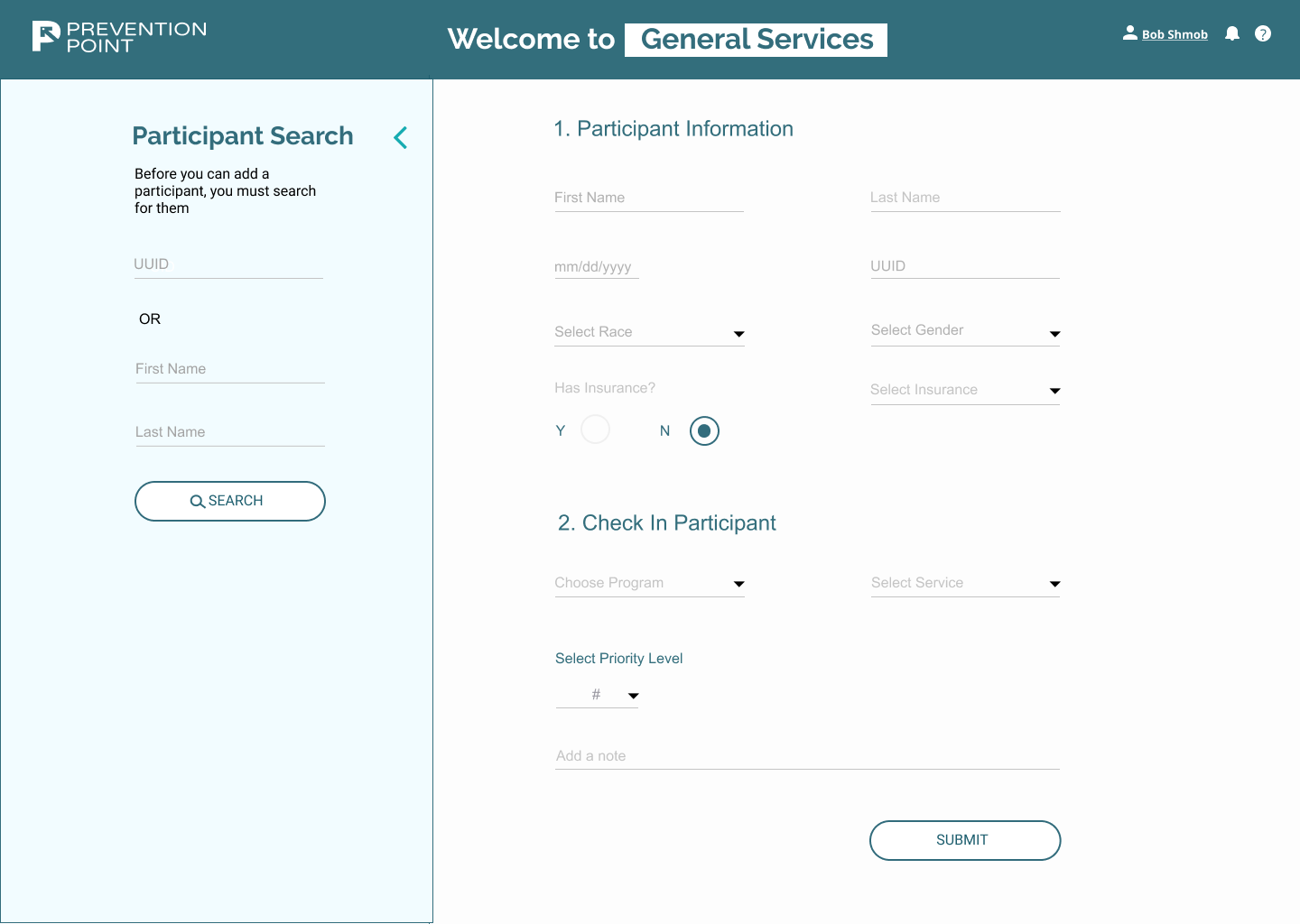
This is a blank Profile Page. This is for when a patient is signing in that day. The form fields are blank and ready to be filled in.

This is a profile that a staff member would see, of they clicked on the name of an individual in the queue. One of the primary differences is visit history, presented on the side. One can see: the date, program and if a note was left by a staff member.