
Esri Product Marketing Templates
What are the Esri product content and design strategy?
In Q1 of 2021, we were tasked to create a content and design strategy to unify product microsites on Esri.com.
A big problem
Esri has a lot of products and a lot of product pages. There are 122 products and 320 individual pages. Many of these product microsites were created with a developing set of design guardrails in place. The result of which was pages that felt wildly different from one another.

122 overview pages from the product catalogue on Esri.com
Another reason for this is because many different designers worked on product microsites, and without any guardrails to guide them, each microsite adhered to the design sensibilities of each designer.
This disparity between pages was also fuelled by unique stakeholder requests. Without concrete guardrails, design solutions and copy were pushed for, by product marketing, to fit their copy, leading to many design disparities within the product ecosystem. As more products were added to the ecosystem, the bigger and more glaring these differences became.
The solution
Design documents that catered to different sizes of products. Core (large) and medium (apps/extensions). These are documents that can both be referenced by new and current designers, as well brought into stakeholder meetings, to create a sense of consistency when talking about a new product microsite.

How I got there
In January, we conducted a sitewide audit across Esri.com. This was led by our UI team leads to conduct our AEM component usage. Each designer conducted an audit for their own sections. I conducted the audit for products. This allows us to identify inconsistencies across pages, as well as identify things that work for us.

Audit of product pages
Things I looked for:
Content structure
Information architecture
AEM component selection
These things helped establish a baseline
I looked at how content was frequently mapped to components. This allowed me to understand how certain chunks of content were thought about at Esri—by the design team and our stakeholders. This in turn allowed me to make recommendations later on when redesigning these templates. Likewise, when looking at information architecture, I looked for the types of pages that were frequently used in a microsite. They were:
Overview page
Feature page
Resource page
Gallery page

These were the types of pages that kept showing up over and over.
workshops, workshops, workshops
I ran workshops with the content, product marketing teams. We had them group chunks of content they thought were important. These workshops were to determine which content chunks were to be required and which were to be optional.
Patterns
Between the teams, certain patterns emerged. The first of which was that what was deemed important were sections that they consistently had content for OR thought about regularly, like value props.

Ordering
In these same workshops, I had teams order this content from top to bottom. They thought through where content could fall from the top of the page to the bottom of the page. I had them think aloud as they did it.
Mapping our Sales funnel
This allowed me to start thinking about our content funnel and how that content matches our business objectives. The purpose of these pages is to educate and convert users.
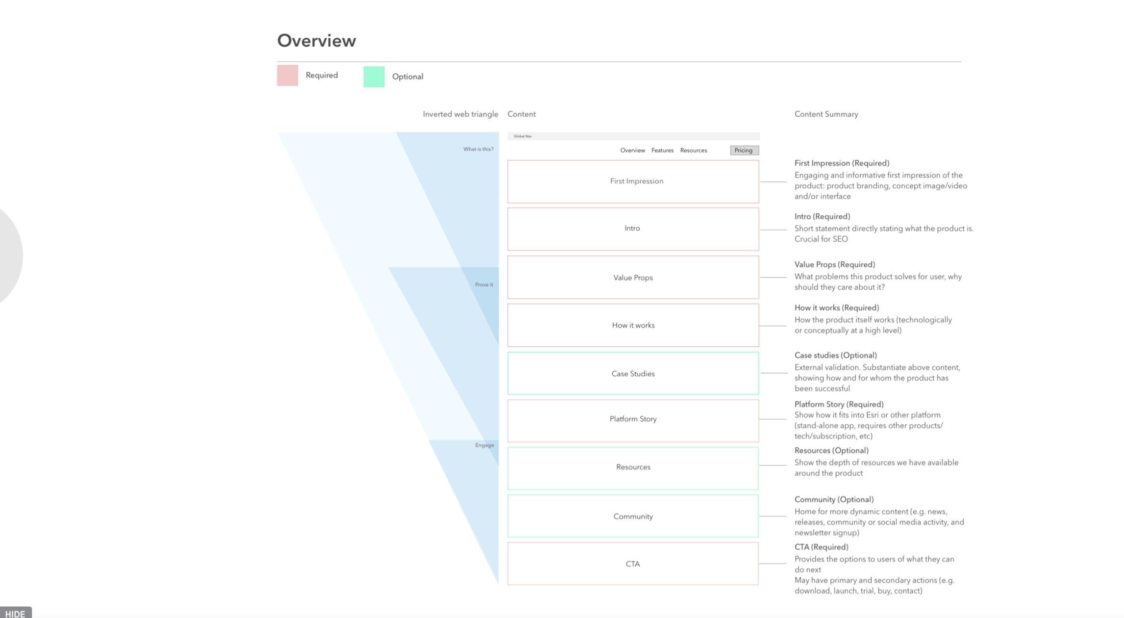
We then mapped components to these different story elements. These became the basis for our templates.

Communicating Strategy:
One of our biggest considerations was communicating strategy. To do this we created strategy decks that explain the purpose of the templates. These templates showcase:
Information archtecture
Content strategy
Component strategy
Wireframes
The ROLL-OUT
Throughout 2021 we rolled out 32 microsites across different product pages on Esri.com. They were:
3 core products
19 extensions
10 app

Results
One of the biggest things is an increase in form fills despite a decrease in traffic. Site visits from 2020 to 2021 decreased because of Covid. Esri’s website traffic soared during the 2020 pandemic. Yet form fills were lower and pages were not converting as well globally. These same pages converted higher with 2000 form fills and uplift of by 3%, despite, the site doubling traffic in 2020.
Ongoing work:
This preliminary work allowed us to establish a design system, for our product pages. We are now getting to a point when we can test individual story elements, within or pages.
How it works (Section of our webpages)
The How it works section is a section dedicated to telling users, how our products function. We are in the process of developing testing to create a more dynamic AEM component that tells better stories.
Internal audit
In Q3 of 2021, I conducted an internal audit of all of our How it Works Sections taking into account UI treatments. For example, if they did, or did not have icons, images, links, and gifs.

This allowed me to see various UI treatments of the same component over time.
External competitive analysis
We also looked at how both, our competitors and other tech companies explained how their products work.

Key finding:
Most tech companies show what their products do while explaining their value. Dedicated sections seem to be unique to Esri.
When displaying content, other companies show a one-to-one match between words and images.
Esri seems to showcase gifs that cover all steps that do not change as you scroll.
Other sites let their pictures do the talking, focussing on succinct explicit verbiage that maps directly to the image being shown.
Key stakeholder interviews
I also interviewed key groups of stakeholders who are responsible for getting product pages up. Teams interviewed were:
UX/UI team
Product Marketing
Copy-writers
Our goal was to get a baseline of how we thought about the ‘How it works” section internally. We are trying to answer the questions: How do we think about the “How it works“ section internally?
What are our baseline thoughts about how the component/content chunk is working on our product pages?
What do we want to find out about this section?
What would we like to see in a redesign of this component/story chunk?
methodology
Each group was asked to answer a series of questions, as quickly as they could, via post-its and write as many answers as they could. We wanted to capture knee-jerk reactions. Each group of stakeholders could not see each others answers.

Questions asked:
I define a how it works section as....?
What do our “How it works” sections do well?
I would like to see_____ in the “How it works”
I would like to know...(question designed to get at the ideal state of the “How it works section“)
The best How it works section I’ve seen is.....? (These could be both internal/external)
Affinity Mapping
We then combined everyone’s answers and looked for global patterns between them.

Some key findings and takeaways
I define a how it works section as....?
Describes a workflow or process in a high level, low-detailed, series of steps
To visually demonstrate what a product does/ How it works/ and problems you are solving
Problems you are solving and data/product integrations (of products)
What do our “How it works” sections do well?
Our copy is succinct and clear
We provide animated gifs that could add value to users by making how the product works easier to understand
How it works provides quick, digestible chunks of information to easily be understood, in regards to the functionality and value of a complex product
I would like to see_____ in the “How it works”
Clear demonstration of value/messaging
Different ways to tell the how it works story accounting for linear and non-linear storytelling
Alignment between images/animation/text
More real-world case studies
Different ways to visually represent how a product works
Have you thought about video?
How crucial are animated Gifs?
I would like to know...(question designed to get at the ideal state of the “How it works section“)
External/User focussed
Is it clear that a product page is different from other pages, based on contextual information on the page?
Should we be using Gifs as our visual or something else?
Internal
Analytics/ user engagement
Can we improve the writing or increase storytelling capabilities
The best How it works section I’ve seen is.....? (These could be both internal/external)
Competitors
Mapbox
Big tech
Tableau
Slack
Microsoft Hollolense
Next steps:
Connecting the dots
One key element to this is connecting our needs back to the competitive analysis. Where is there overlap between things we want to see and what other companies are doing? This allows us to gain a knowledge base that can be rolled into designs and prototypes.
Rapid prototyping and testing
The iterative design will sit at the heart of this project. This will be informed by continuous usability tests. It will also be informed by impression testing from current Esri users, of product pages.
Questions for testing:
For a new component
What types of content/types of content will make the biggest impact on our users?
What should the written content be, to best inform our users?
Should they be a linear series of steps, or are individual processes best shown in a non-linear fashion?
For an existing component
is our copy clear, or does it need to change?
How crucial is showing animation/motion?